Naturli’ Rebrand
Rebranding & Packaging Design for Naturli’
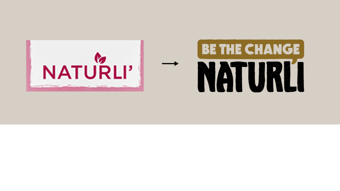
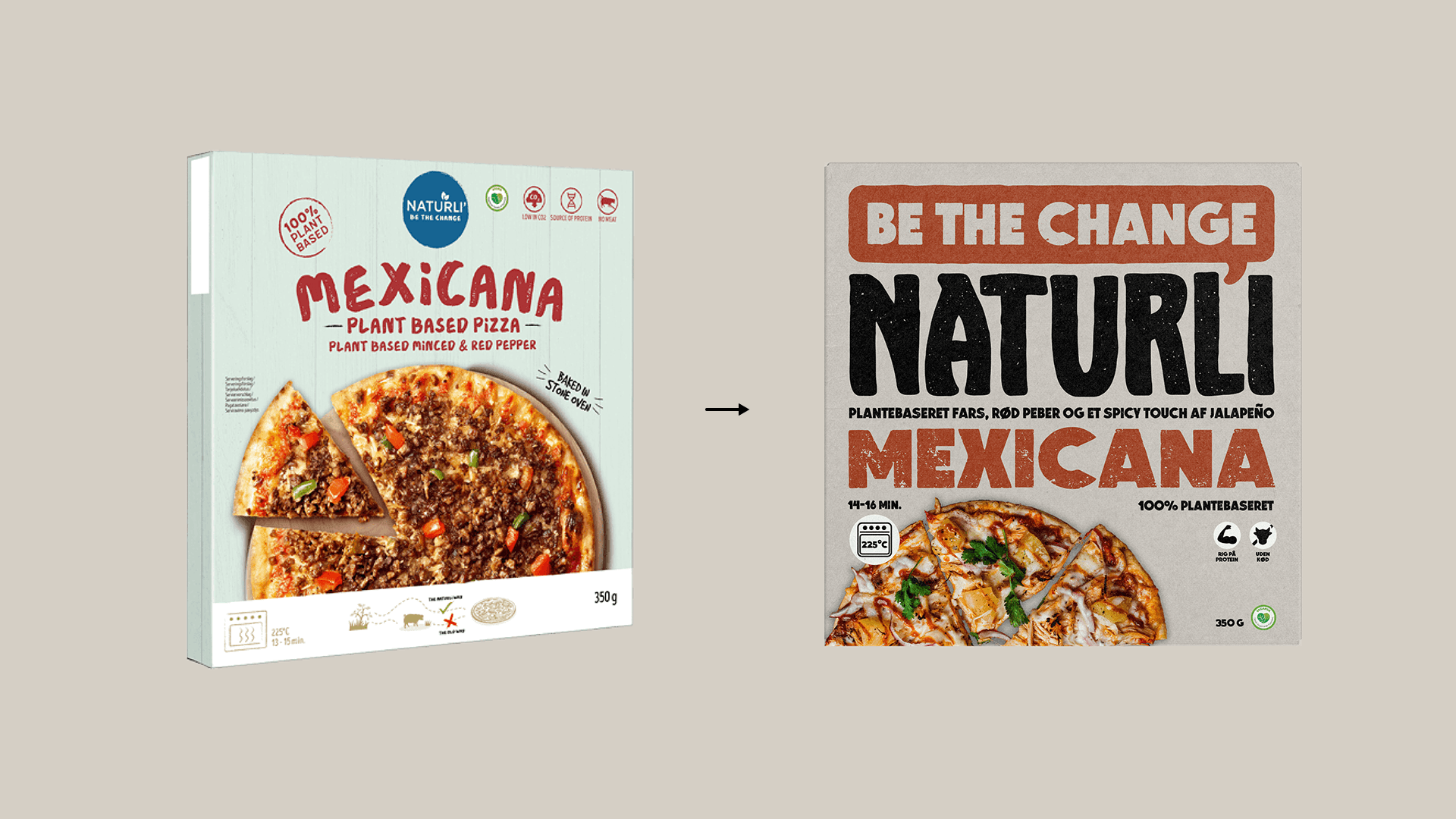
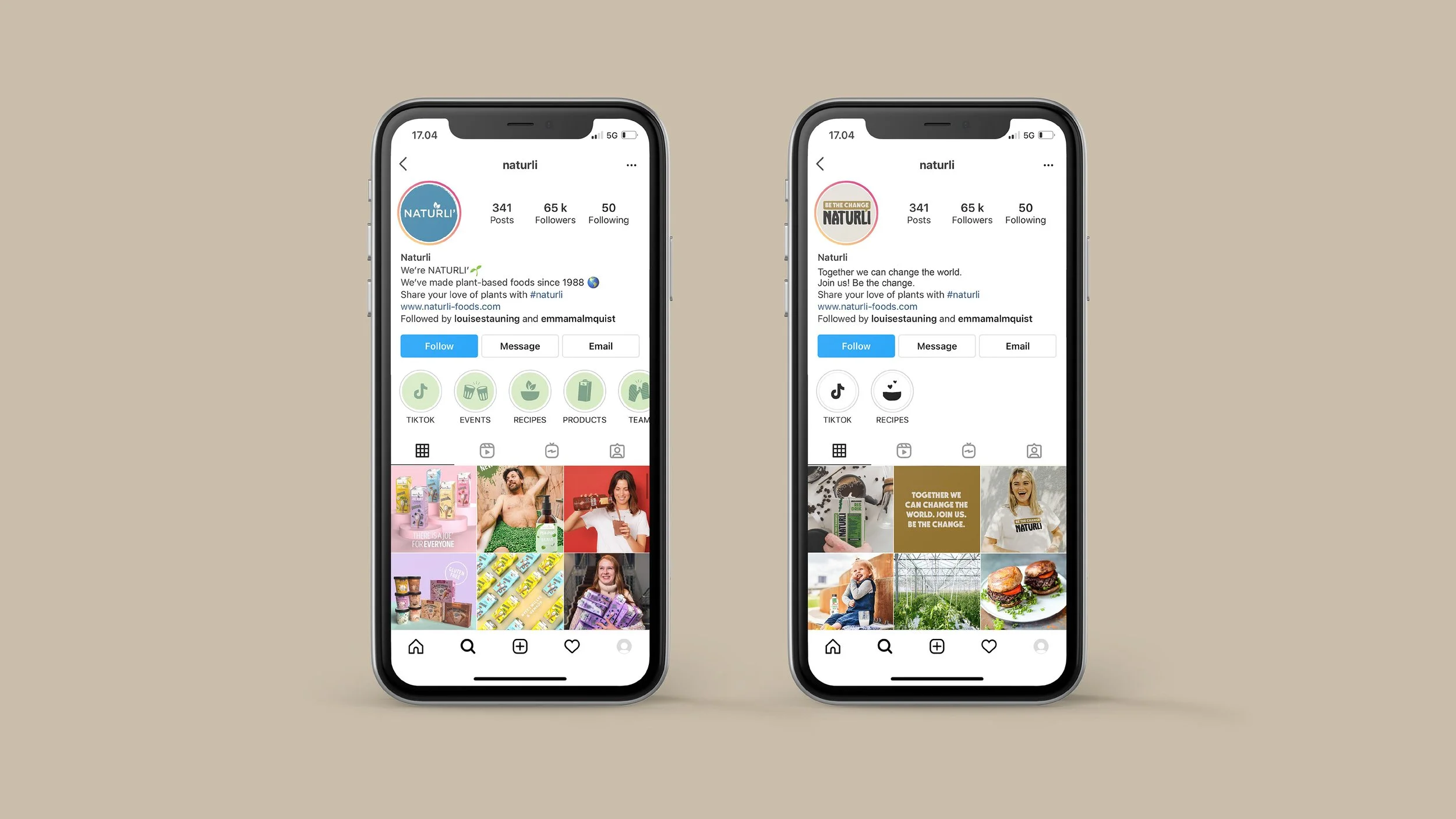
I developed this Naturli’ rebrand as my final exam project at DMJX. The starting point was clear: the existing identity lacked consistency. The packaging system felt fragmented, the logo had limited impact, and through a small survey I conducted, many consumers described the colours as “unnatural” and visually confusing for a brand rooted in plant-based values.
That insight became central to the redesign.
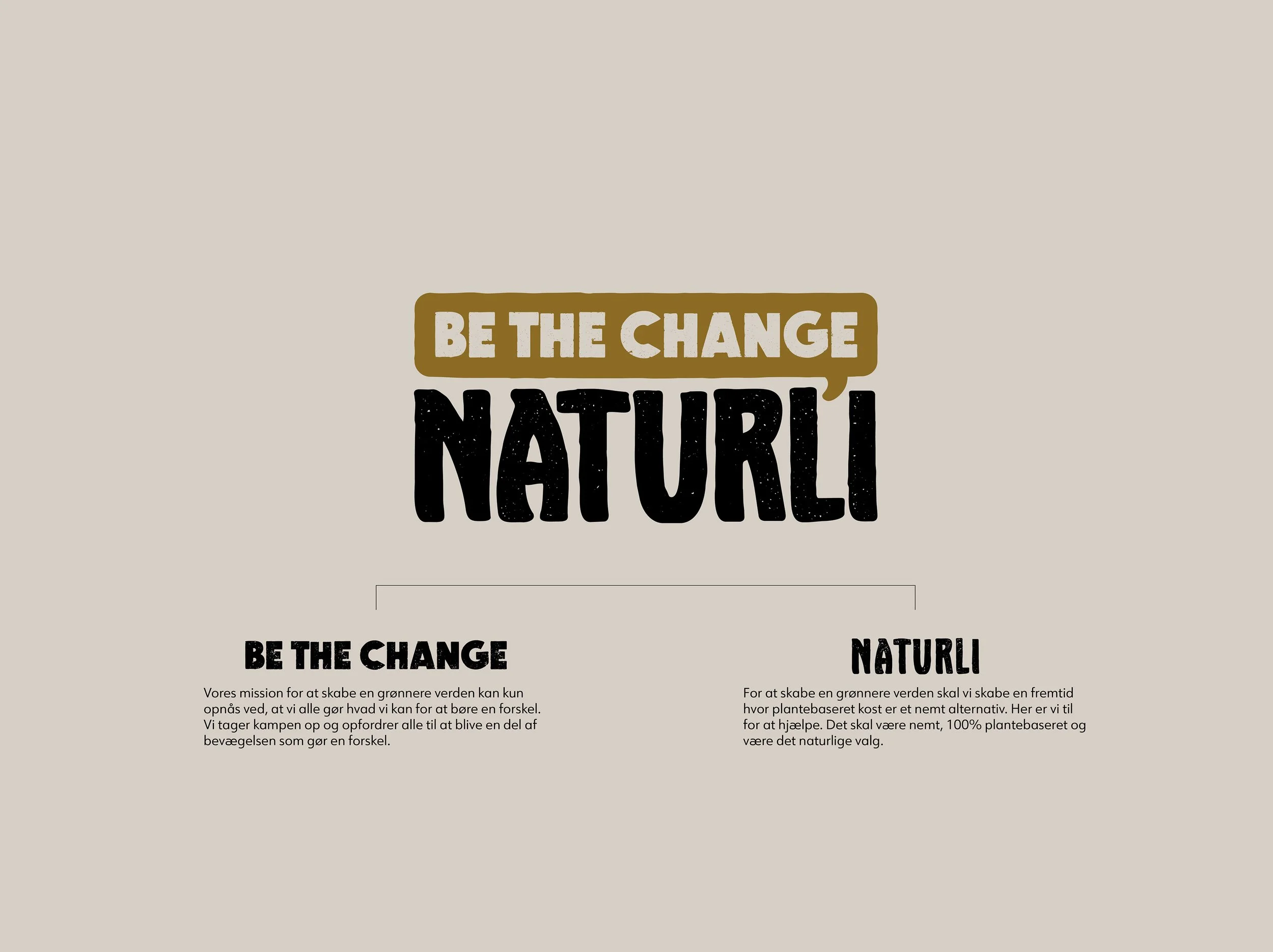
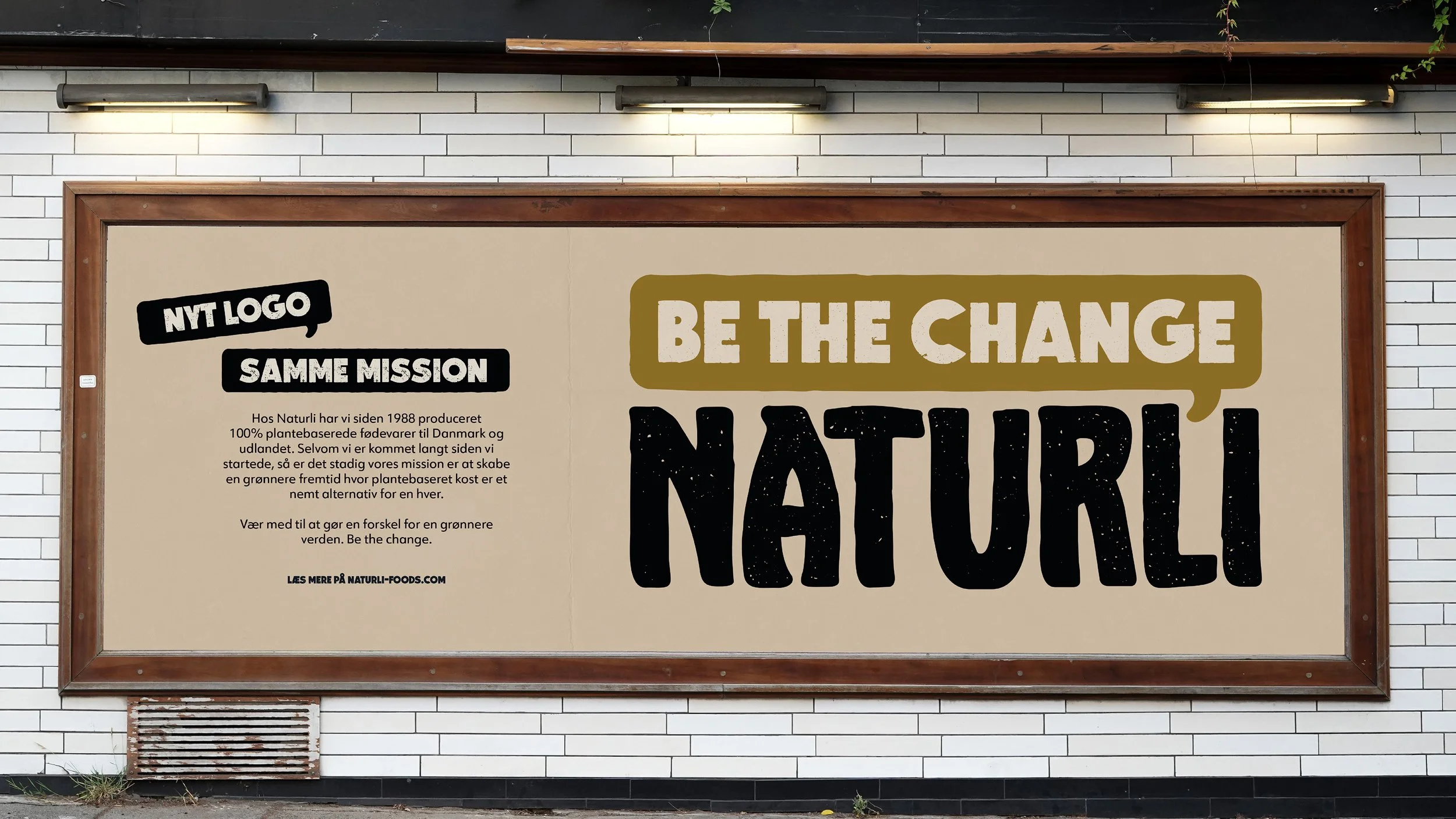
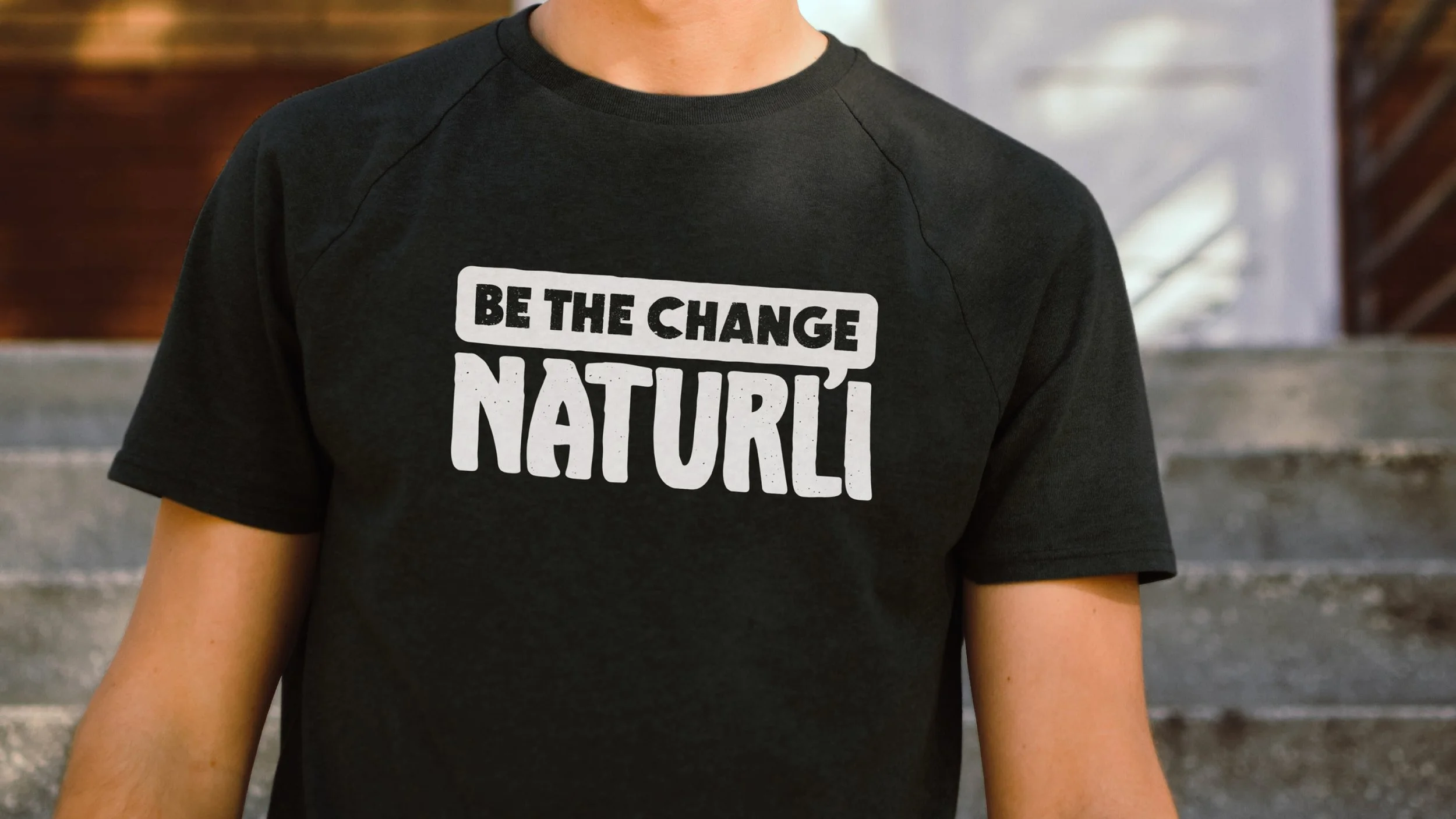
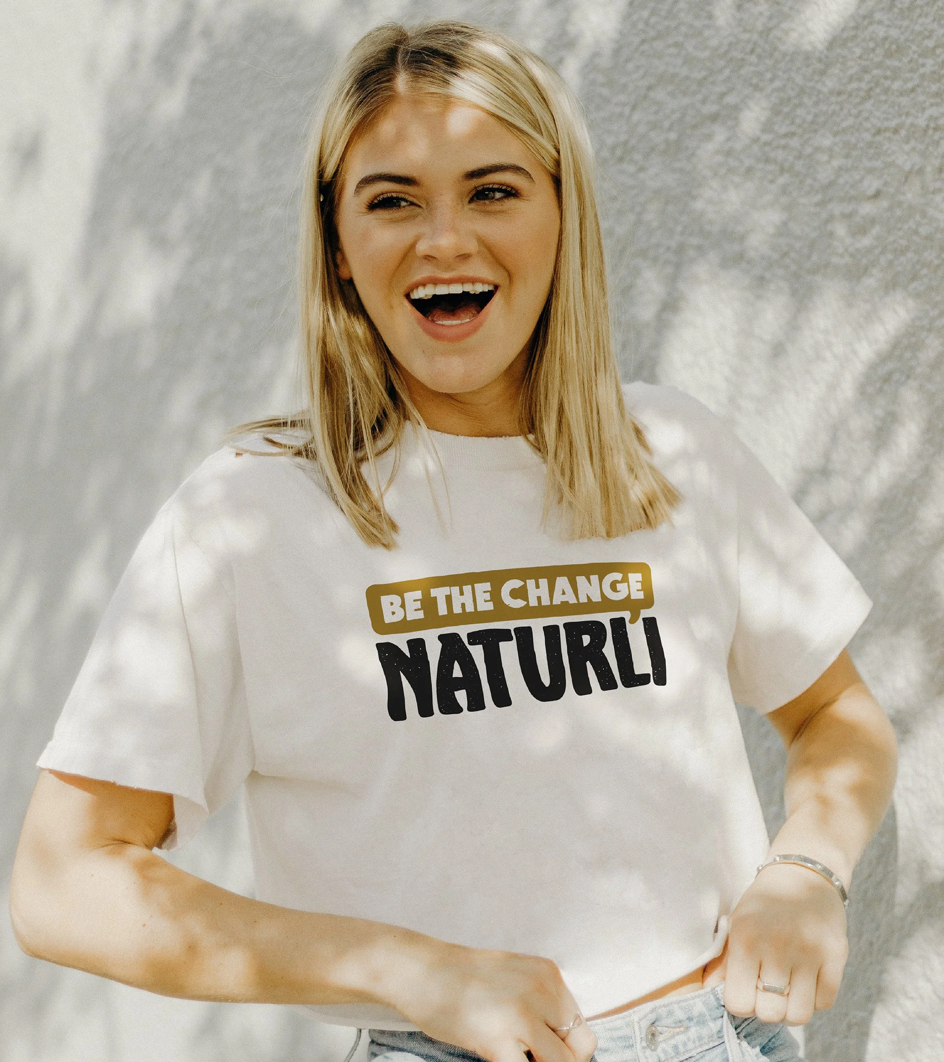
The new concept, “Be the Change,” shifts Naturli’ from being a plant-based alternative to being a confident movement. Instead of communicating substitution, the identity communicates choice, action, and collective responsibility.
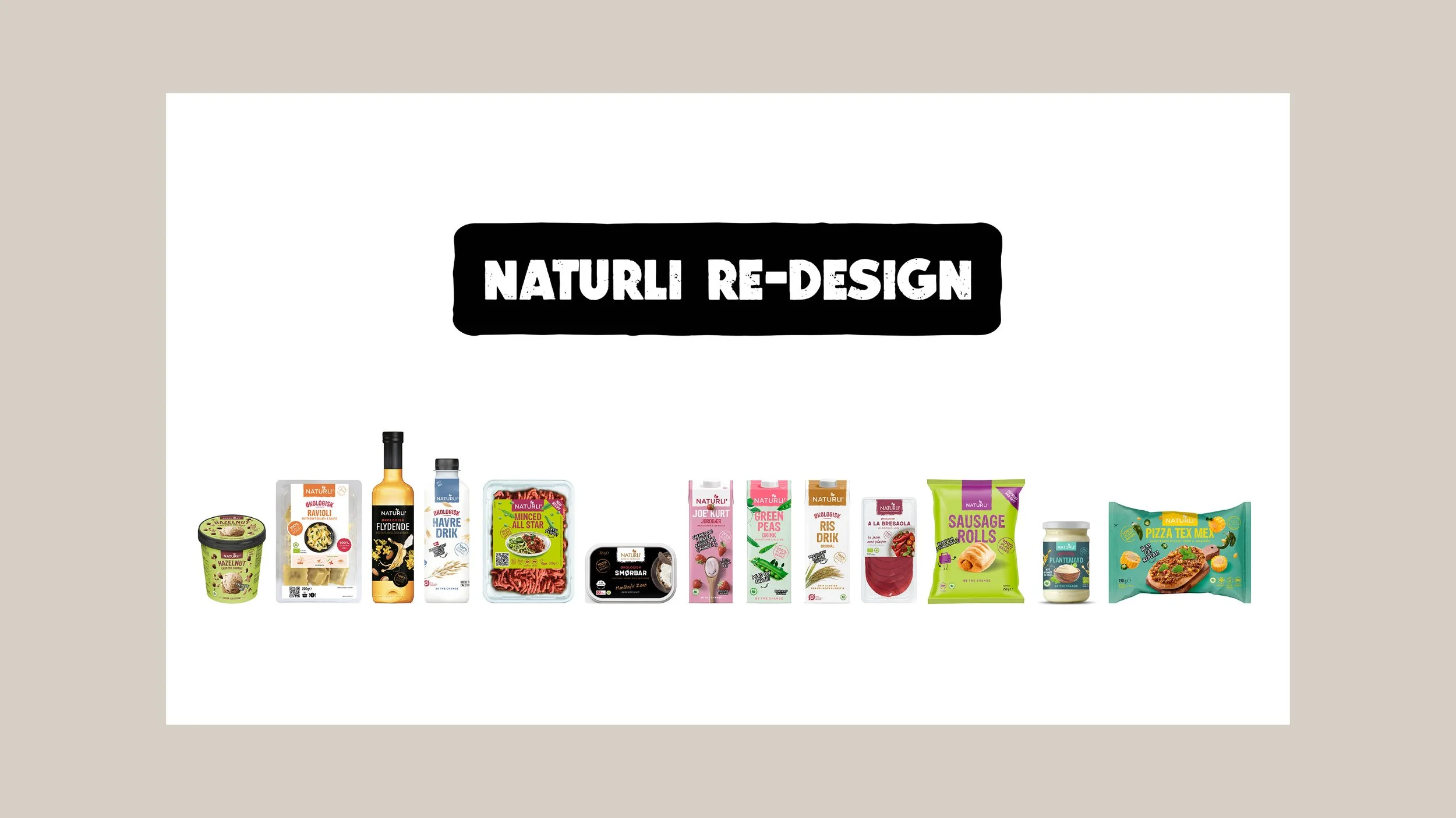
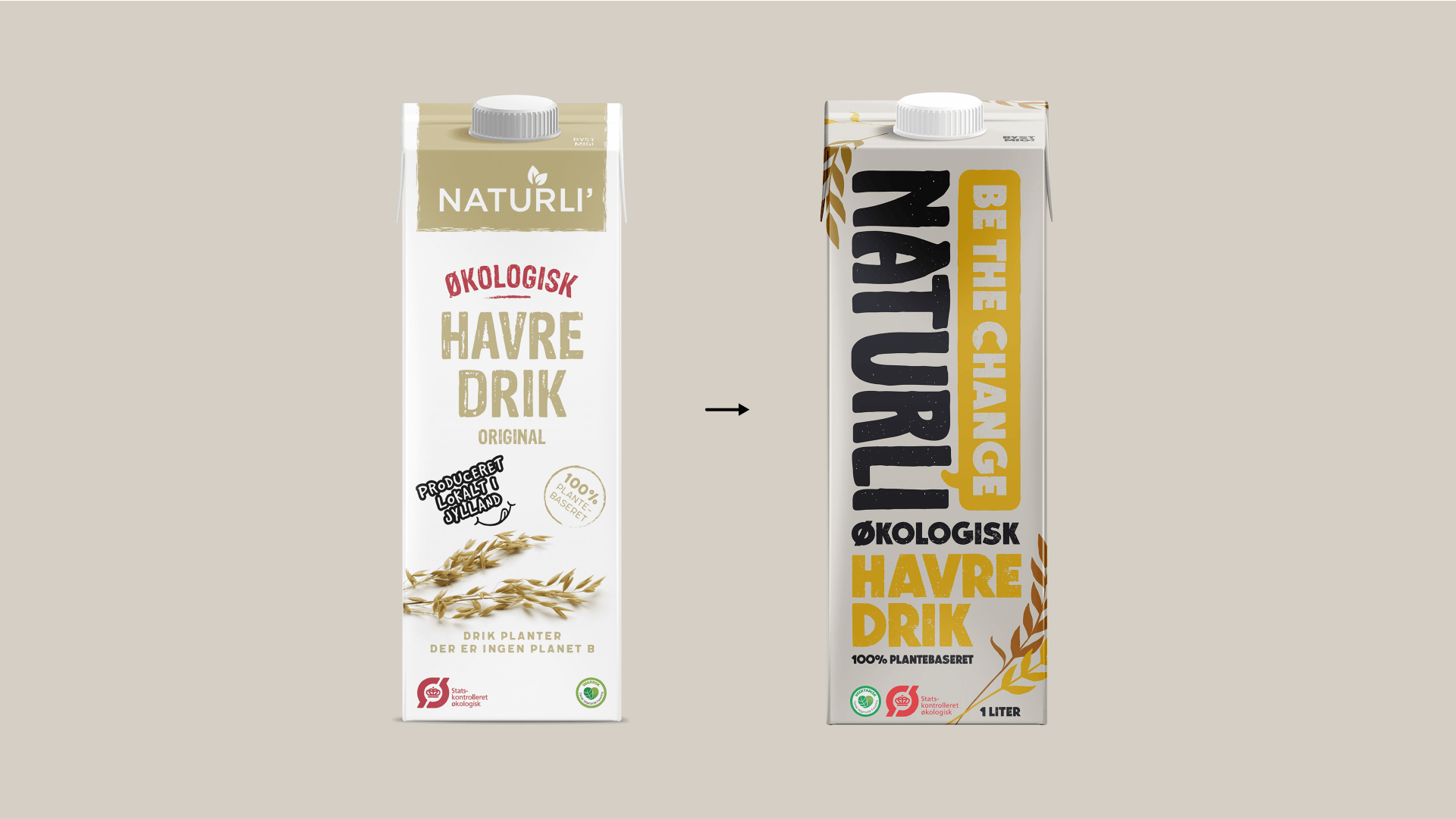
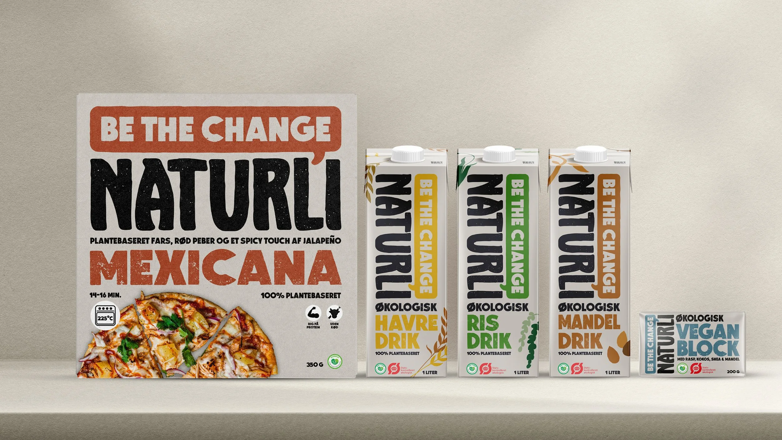
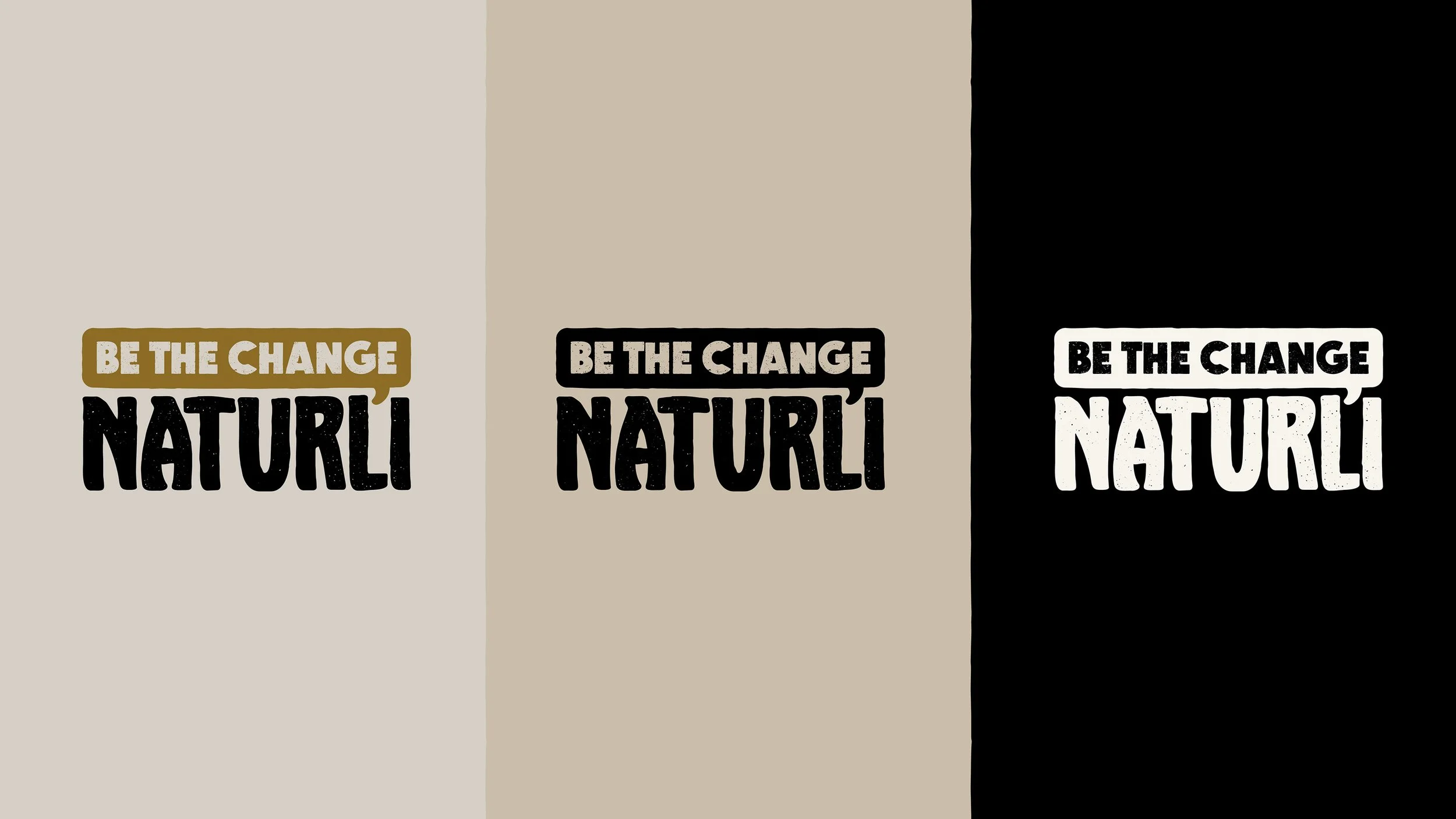
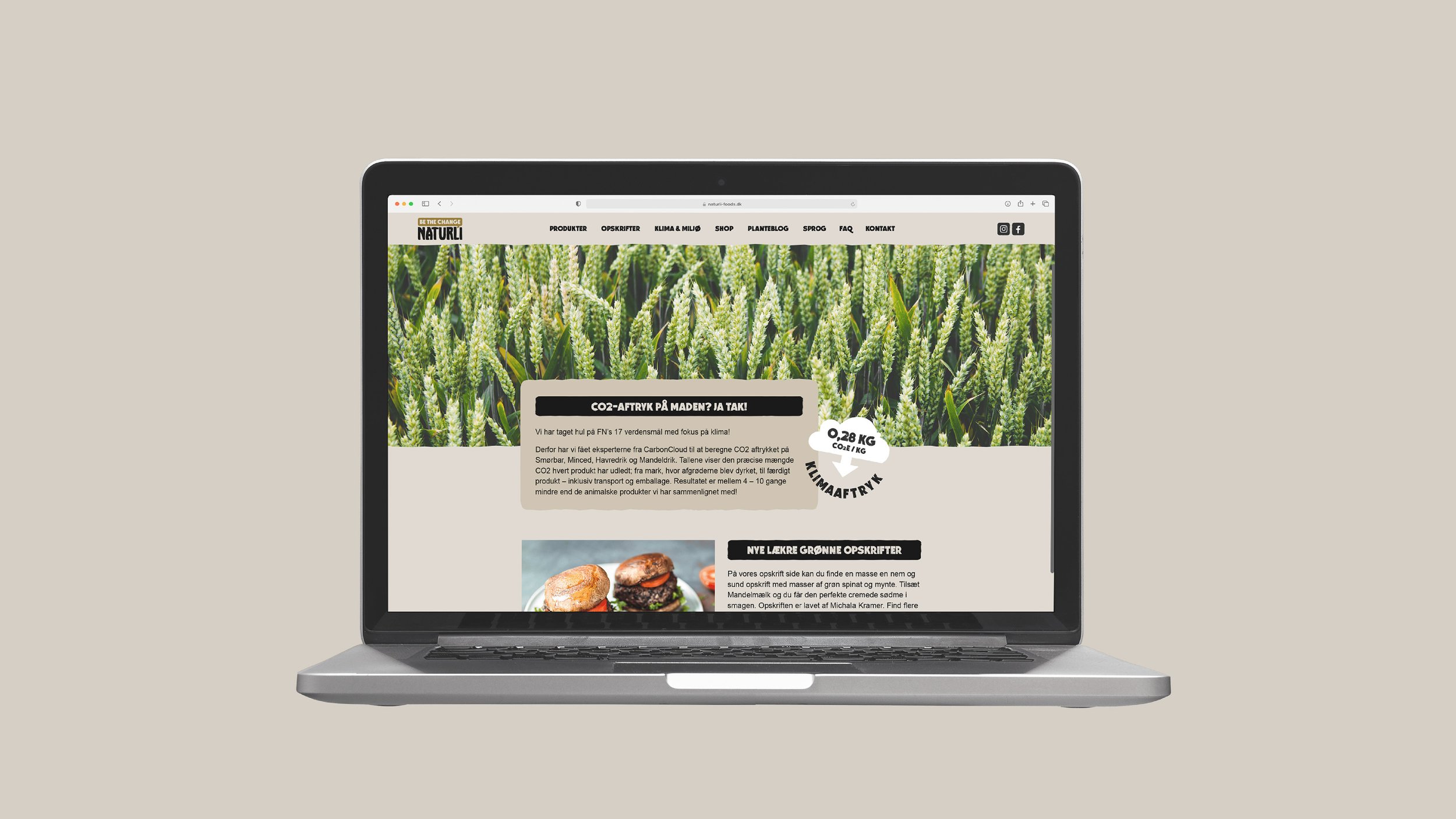
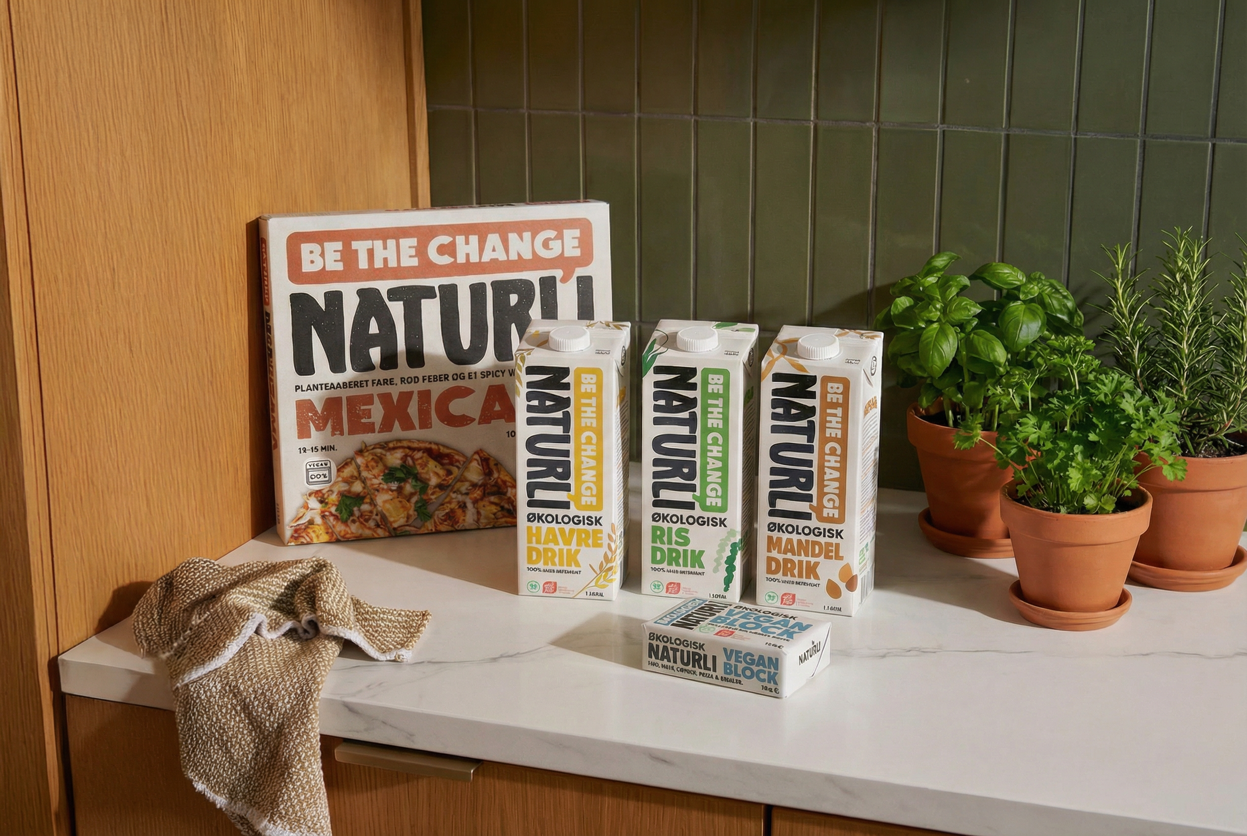
Visually, I simplified and strengthened the logo to create clarity and better scalability across touchpoints. I built a more structured packaging system with a clear typographic hierarchy and stronger brand blocking to ensure consistency across the entire product range. The colour palette was refined into warmer, earthier tones to better align with the brand’s natural positioning and to increase shelf coherence.
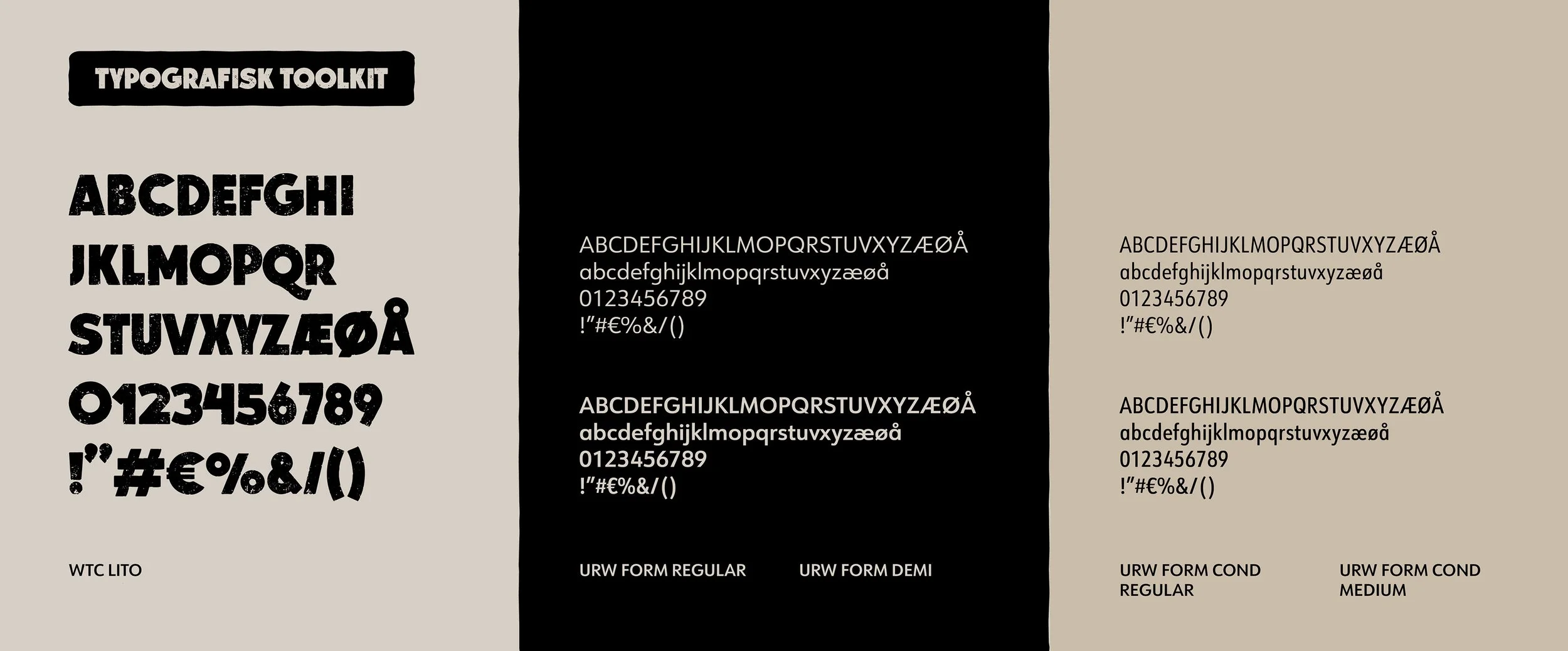
Typography became a key branding tool: a bold, condensed display type creates recognisability and shelf impact, while a clean grotesque ensures legibility and credibility in more informational contexts. Subtle texture adds warmth and tactility, preventing the identity from feeling overly polished or artificial.
The result is a cohesive, scalable brand system that feels confident, grounded, and aligned with Naturli’s mission: making plant-based the natural and obvious choice.
This project reflects how I approach branding - research-informed, concept-driven, and built as a system, not just a surface.
2021